[TestDome/HTML & CSS] Test Dome 6 questions in HTML/CSS
Avatar
Every user on your website has an image avatar that is displayed when they post a comment. You want to style these images differently from other images on your site. Add a CSS class named avatar that fulfils the following requirements:
- The avatar’s border is rounded, so that it appears as a circle.
- The avatar’s width and height are both 150px.
- The avatar has a solid border, has a width of 2px, and be colored gray.
For example, the avatar in the template should look like:

Solution
border-radius: 50% means make border circle!
<!DOCTYPE html>
<html>
  <head>
    <meta charset="utf-8">
    <title>Avatar</title>
    <style>
      /* Write your CSS solution here (do not edit the surrounding HTML) */
      .avatar{
        border-radius: 50%;
        width: 150px;
        height: 150px;
        border: solid 2px gray;
      }
    </style>
  </head>
  <body>
    <img class="avatar" src="https://goo.gl/khGCrk" alt="avatar" />
  </body>
</html>
Spreadsheet
You’ve been sent a snippet from a spreadsheet, and have been asked to re-create it for display on the company’s internal website.
Re-create the following spreadsheet using HTML, in a table appropriately captioned “Purchase Orders”.

Solution
need to mermorize table tags.
<!DOCTYPE html>
<html>
  <head>
    <meta charset="utf-8">
    <title>Spreadsheet</title>
    <style>
      td {
        text-align: right;
        width: 33%;
      }
      td, th, table {
        border: 1px solid;
        border-collapse: collapse;
      }
      th {
        text-align: left;
      }
    </style>
  </head>
  <body>
    <table>
      <caption>Purchase Orders</caption>
      <thead>
      <tr>
        <th>Order Date</th>
        <th>SKU</th>
        <th>Quantity</th>
      </tr>
      </thead>
      <tbody>
      <tr>
        <td>07-16-2018</td>
        <td>523402</td>
        <td>54</td>
      </tr>
      </tbody>
    </table>
  </body>
</html>
Styling Links
Write CSS so that the link <a href="http://www.testdome.com">Check documentation</a> looks like the one in the image below, and the cursor looks like a question mark when hovering over the link

Solution
In CSS :before creates a pseudo-element that is the first child of the selected element.
It is often used to add cosmetic content to an element with the content property. It is inline by default.
<!DOCTYPE html>
<html>
  <head>
    <meta charset="utf-8">
    <title>Styling links</title>
    <style type="text/css">
      /* Write your CSS solution here (do not edit the surrounding HTML) */
      a {
        cursor: help;
        text-decoration: none;
        text-transform: uppercase;
        color: lavender;
      }
      a:before {
        content: ">";
      }
      a:after {
        content: "<";
      }
    </style>
  </head>
  <body>
    <a href="http://www.testdome.com">Check documentation</a>
  </body>
</html>
Inspector
Fix the bugs in the following HTML code.
<!DOCTYPE html>
<html>
  <head>
    <meta charset="utf-8">
    <title>Company page</title>
  </head>
  <body>
    <paragraph>Welcome! Here you can find the following things:</paragraph>
    <ol>
      <em><li><a href="#logo">Company's logo</a></li></em>
      <li><a href="#employees">List of employees</a></li>
    </ol>

    <h1>Company's logo
    <paragraph>Company uses the following logos:</paragraph>
    <ul>
      <li>New logo:</li><img source="https://www.testdome.com/content/images/logo/favicon_32x32.png"/>
      <li>Old logo:</li><img source="https://www.testdome.com/content/images/icons/order-bullet.png"/>
    </ul>

    <h1>List of employees
    <thead>
      <th>First name</th>
      <th>Last name</th>
    </thead>
    <table>
      <tr>
        <td>Mary</td>
        <td>Williams</td>
      </tr>
      <tr>
        <td>James</td>
        <td>Smith</td>
      </tr>
    </table>
  </body>
</html>
Solution
- there are not any ‘paragraph’ tags.
- there are not
</h1>s - img tag’s property is src
- have to insert element em inside the li tags
<!DOCTYPE html>
<html>
  <head>
    <meta charset="utf-8">
    <title>Company page</title>
  </head>
  <body>
    <p>Welcome! Here you can find the following things:</p>
    <ol>
      <li><a href="#logo"><em>Company's logo</em></a></li>
      <li><a href="#employees">List of employees</a></li>
    </ol>

    <h1>Company's logo</h1>
    <p>Company uses the following logos:</p>
    <ul>
      <li>New logo:<img src="https://www.testdome.com/content/images/logo/favicon_32x32.png"/></li>
      <li>Old logo:<img src="https://www.testdome.com/content/images/icons/order-bullet.png"/></li>
    </ul>

    <h1>List of employees</h1>
    <table>
      <thead>
        <tr>
          <th>First name</th>
          <th>Last name</th>
        </tr>
      </thead>
      <tbody>
        <tr>
          <td>Mary</td>
          <td>Williams</td>
        </tr>
        <tr>
          <td>James</td>
          <td>Smith</td>
        </tr>
      </tbody>
    </table>
  </body>
</html>
Semantics
Update the website’s HTML, without using JavaScript or CSS, to make use of semantic elements so that
- The classless outer div element is replaced with a more appropriate element.
- The divs with the image and caption classes are replaced with self-contained content elements.
- The divs with the lorem-ipsum and description classes are replaced with elements, so that by default only the contents of the description element are shown. When the contents of the description element are clicked, the visibility of the rest of the lorem-ipsum element is toggled.
Solution
<!DOCTYPE html>
<html>
  <head>
    <meta charset="utf-8">
    <title>Semantics</title>
  </head>
  <body>
    <main>
      <h1>Lorem Ipsum</h1>

      <figure class="image">
        <img src="https://goo.gl/zF9eky" alt="Lorem Ipsum">
        <figcaption class="caption">Lorem Ipsum</div>
      </figure>

      <details class="lorem-ipsum">
        <summary class="description">Lorem ipsum dolor sit amet, consectetur adipiscing elit...</summary>
        <p>Lorem ipsum dolor sit amet, consectetur adipiscing elit.
          Curabitur vitae hendrerit mauris. Lorem ipsum dolor sit amet, consectetur adipiscing elit.
          Mauris lacinia scelerisque nibh nec gravida.
          Duis malesuada nec nibh sit amet pulvinar.
          Phasellus congue porttitor arcu, ut suscipit nibh aliquam vel.
          Nunc arcu lectus, egestas ut sem ac, euismod porttitor eros.
          Phasellus tincidunt consequat pharetra. Maecenas sodales purus at nulla finibus dapibus.
          Nullam varius at nisl vel euismod. Fusce aliquet ligula non tempor fermentum.
          Nam fermentum posuere mauris, quis aliquam nibh dictum sed.</p>
      </details>
    </main>
  </body>
</html>
Articles
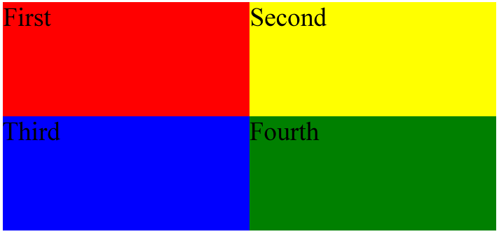
Using CSS only (without adding additional HTML attributes), style articles so that they occupy the whole browser window and have the following properties
| ARTICLE | POSITION | BACKGROUND COLOR |
|---|---|---|
| First | Upper-left quarter | Red |
| Second | Upper-right quarter | Yellow |
| Third | Lower-left quarter | Blue |
| Fourth | Lower-right quarter | Green |

Solution
<!DOCTYPE html>
<html>
<head>
  <meta charset="utf-8">
  <title>Articles</title>
  <style>
    body {
      margin: 0px;
      height: 100%;
    }
    /* Write your CSS solution here (do not edit the surrounding HTML) */
    article {
      min-height: 50%;
      width: 50%;
      float: left;
    }
    article:nth-child(1) {
      background-color: red;
    }
    article:nth-child(2) {
      background-color: yellow;
    }
    article:nth-child(3) {
      background-color: blue;
    }
    article:nth-child(4) {
      background-color: green;
    }
  </style>
</head>
<body>
  <article>First</article>
  <article>Second</article>
  <article>Third</article>
  <article>Fourth</article>
</body>
</html>
or, you can use flex and flex-wrap: wrap
The end
댓글남기기